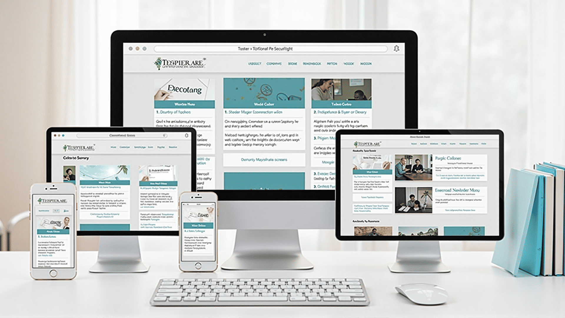
Creating designs that respond beautifully across a variety of devices is an essential skill for today’s digital creators. As the number of devices and screen sizes continues to expand, the ability to build interfaces that look appealing and function optimally in any context is more important than ever. Here are some techniques you can employ to ensure your web projects retain their aesthetic and functional integrity no matter where they appear.
One of the primary steps in crafting an adaptive design is utilizing fluid grids. Unlike fixed-width layouts that can appear awkward on different screens, fluid grids dynamically adjust to fit the device's screen size. By employing relative units like percentages instead of fixed pixels, elements in your design will naturally rearrange based on the viewport’s dimensions. This ensures that content is consistently presented in a clear and harmonized manner.
In combination with fluid grids, flexible images are crucial in shaping responsive designs. By setting images to a maximum width of 100%, they automatically adjust to fit within their parent container without surpassing its bounds. This not only maintains visual integrity but also improves load times by ensuring images are no larger than necessary.
Media queries are another cornerstone of responsive design. They allow designers to apply specific styles based on the conditions such as min-width or max-width of the user's device. This enables precise control over how designs are displayed on different devices, allowing for adjustments to typography, layout, and other visual elements without compromising the overall design aesthetics.
Additionally, prioritizing a mobile-first approach can streamline the design process. By starting with the smallest device, you’re ensuring the core of your design is efficient and fast-loading, adding enhancements as the screen size increases. This approach not only saves time but also helps in establishing a solid foundation for the design, making adjustments easier as device complexity scales up.
Ensuring high touch target accessibility is another vital aspect. In touch interfaces, ensuring that interactive elements like buttons are easily tappable, even when resized, improves user experience significantly. This focuses on usability, which is as important as the visual presentation in a responsive design approach.
Another vital consideration is typography. Choosing fonts that are legible at various sizes and ensure that text scales well with changes in screen dimensions is fundamental. Utilizing responsive type scales provides cohesion throughout different viewing contexts, maintaining brand consistency while improving readability.
Testing responsively is another practice that should not be overlooked. Platforms and tools are available to preview how your design looks and functions across a wide array of devices. Regularly testing your design in various scenarios ensures that any potential issues are caught early and provides insight into how adjustments can be made if necessary.
By implementing these strategies, designers can create projects that are not only visually appealing but also resilient and adaptable to the diverse range of user contexts present in today’s world. Ultimately, the goal of responsive design is to provide users with a seamless and consistent experience, reinforcing the functionality and message of your web project across all devices.